
Team Administration Platform
About the Project
Managing a team can be tricky — too many tasks, scattered information, and constant scheduling
issues. Mango makes it easier. It’s a smart tool that helps managers
organize processes and plan resources better. With Mango, managing a team becomes simple,
connected, and ready for the future.
Main Focus
My mission was clear: create a system that supports efficient management, smart data tracking, and
digital employee information — all within one intuitive platform. Every feature had to work
together seamlessly, helping teams move faster, smarter, and with confidence.
-
Efficient Management
Set up a clear and easy process for requesting time off, keeping track of requests, and approving them quickly.
-
Data Tracking
Provide real-time access to important metrics so that actions can be taken quickly.
-
Digital Employee Info
Store all employee info, like contacts and performance reviews, in one place.
Symbolic Identity
The logo had to be more than just a name — it had to feel alive. Inspired by the fresh energy of a
mango fruit, I merged letterforms with imagery to craft a logo that’s vibrant, memorable, and
immediately recognizable. A playful yet professional identity for a future-ready tool.


From Sketches
Starting with pen and paper, I explored countless ideas. After multiple iterations in Illustrator,
the final design emerged: a simple, elegant solution using letterforms symbolically and harmoniously
— a logo that feels as intuitive as the product itself.
Bold and Warm Colors
The color palette had to feel powerful yet welcoming. I chose bold, warm, and neutral shades that
balance energy with sophistication. They’re engaging enough to catch the eye, but soft enough to
create a positive, trustful environment — the perfect backdrop for managing people and processes.
-
#F5C05C
-
#98C28F
-
#111212
-
#FFFFFF
Clean and Clear Typography
Typography matters when you need clarity. I picked Poppins, a geometric sans-serif with wide
letterforms and easy readability. It ensures that every piece of information is accessible and
friendly, enhancing the user experience without distracting from the platform’s core functions.

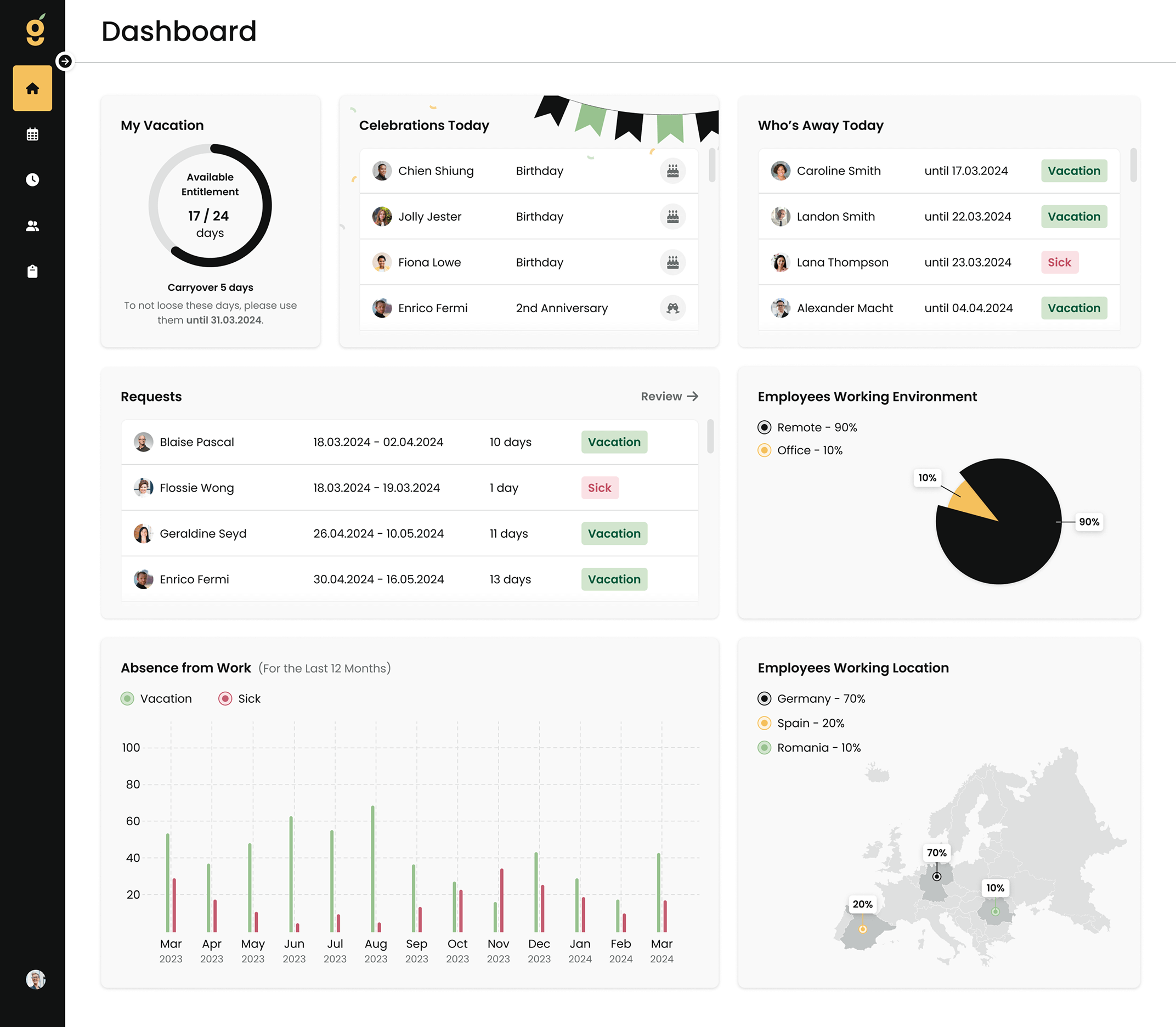
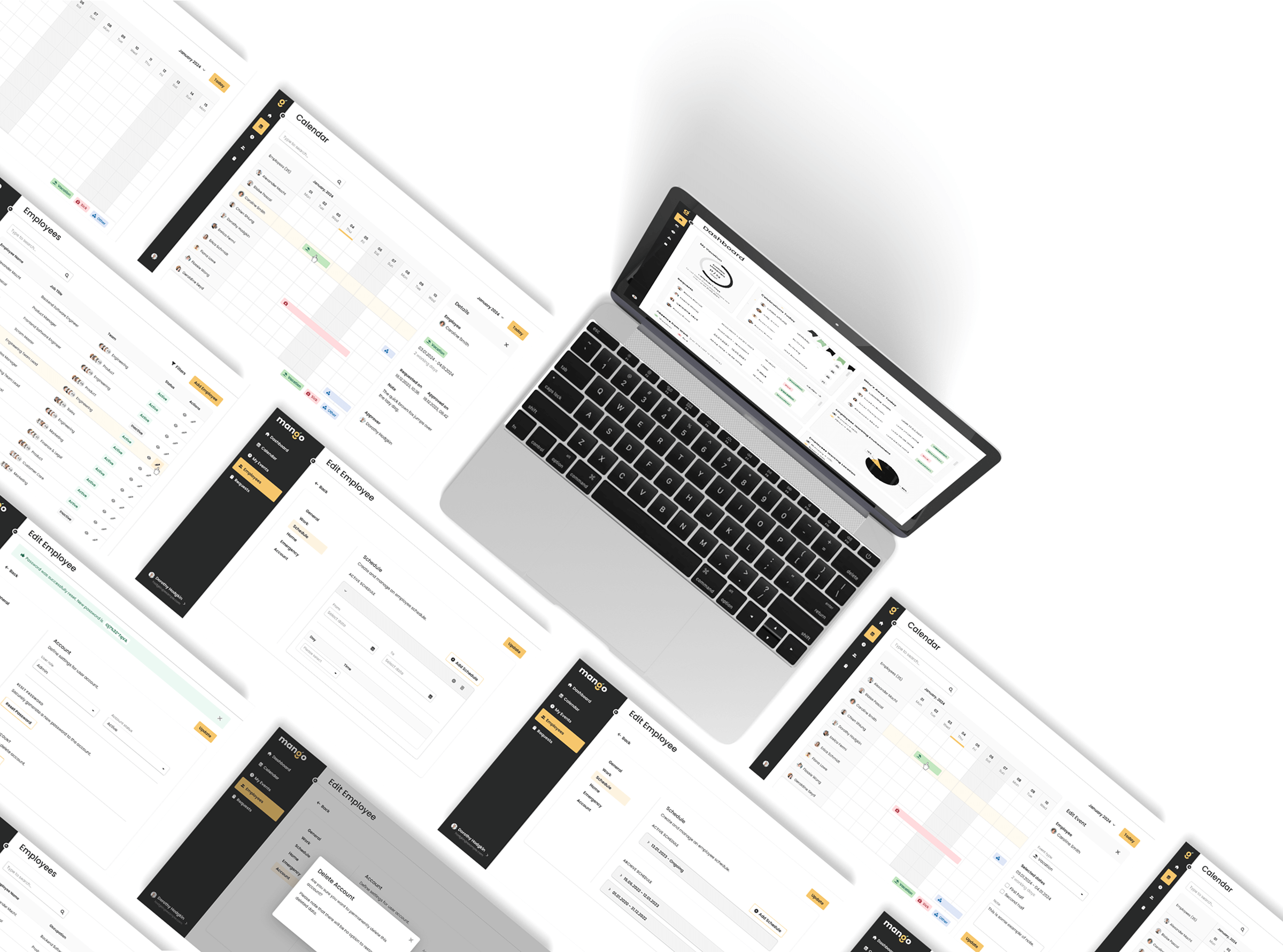
Dashboard
The dashboard brings critical information to life. Managers can monitor indicators, stats, and
insights in real time — all laid out clearly for quick decision-making. No need to dig through data
— Mango puts what matters most right in front of user.
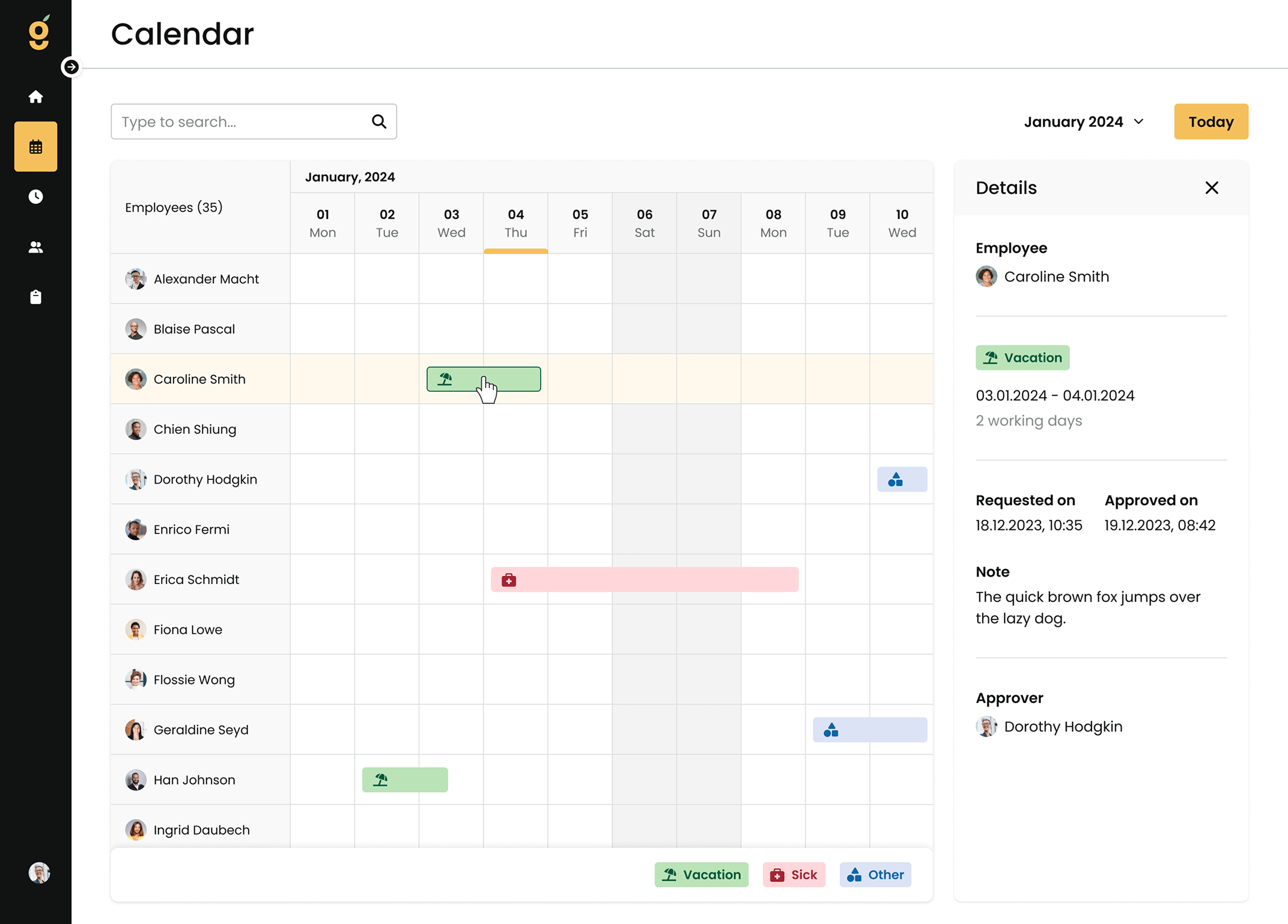
Smooth Scheduling
Managing time off can be chaotic. That’s why Mango’s calendar makes it simple to view and approve
employee leave requests. It supports smarter planning, reduces scheduling gaps, and encourages a
healthy work-life balance for everyone on the team.
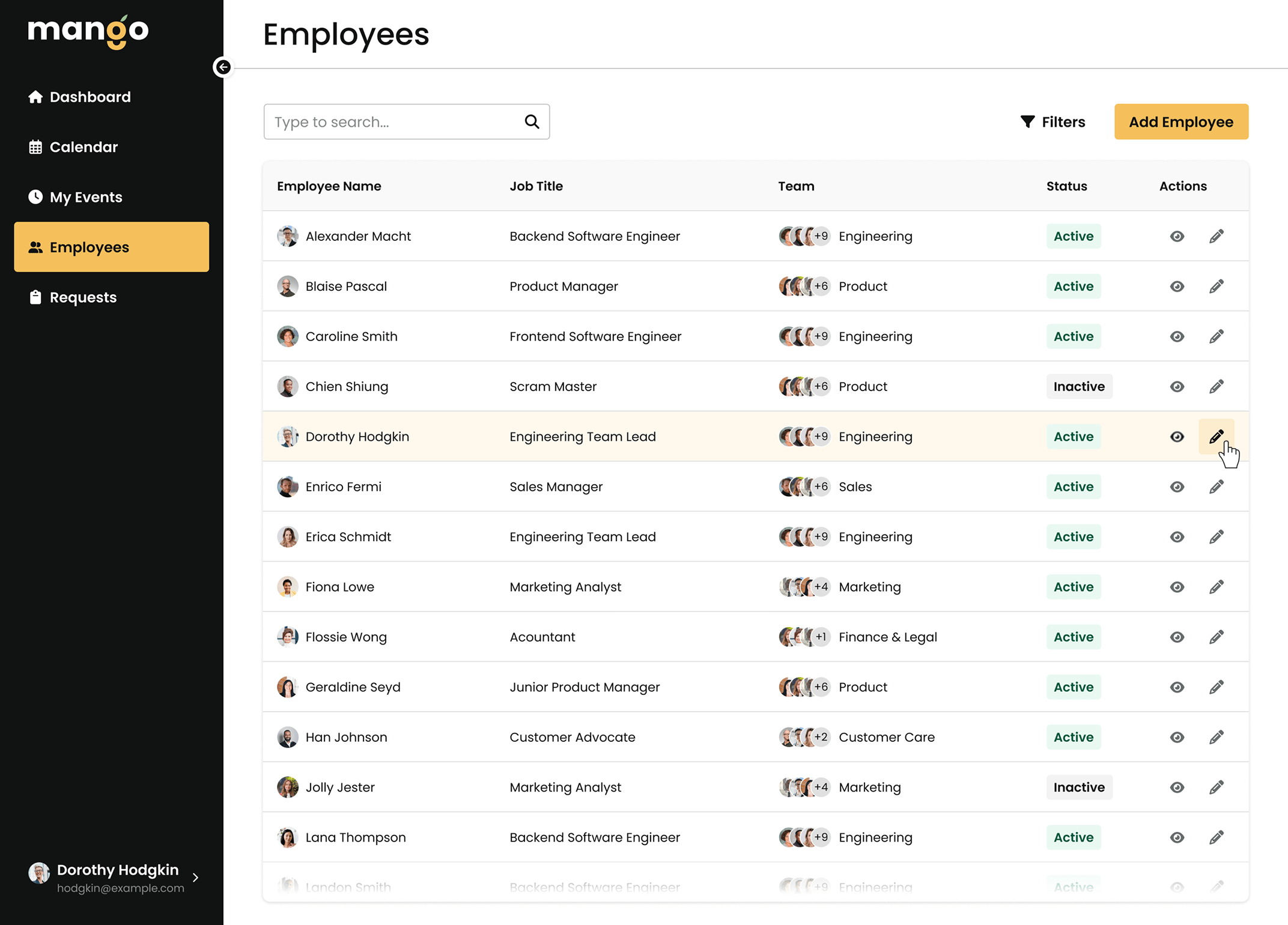
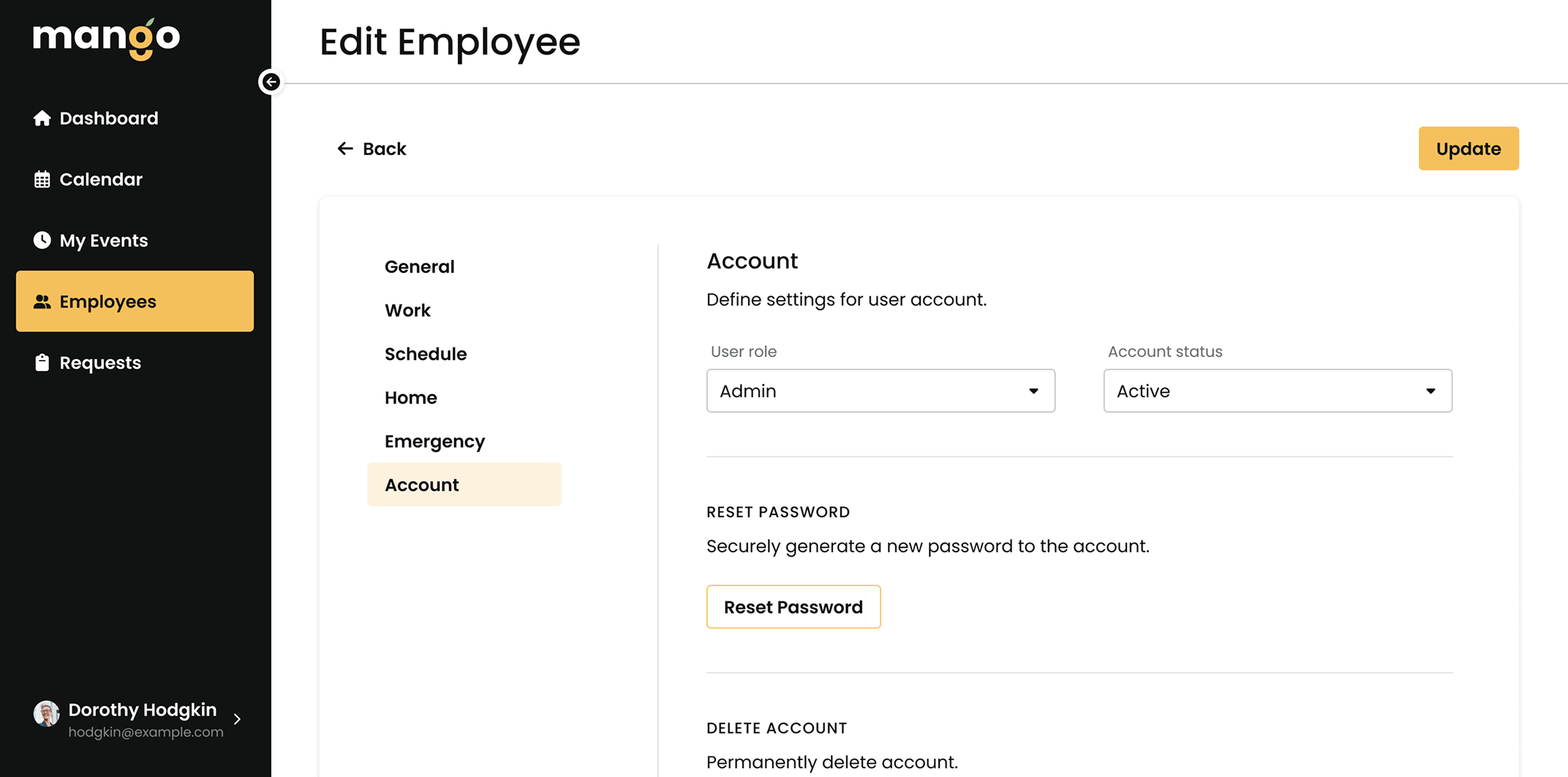
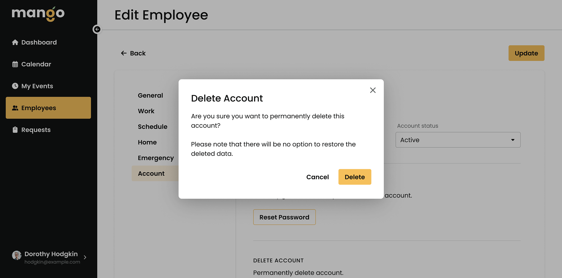
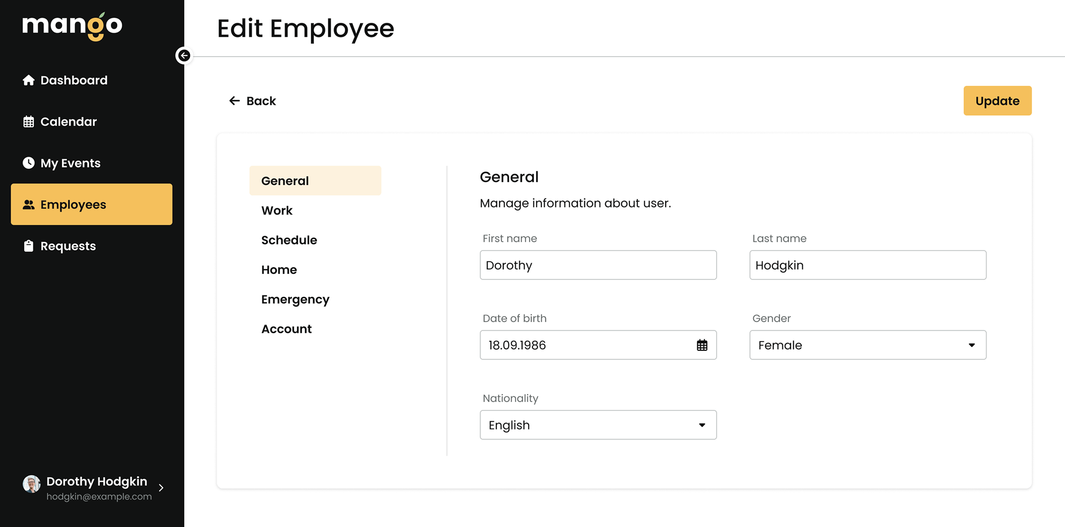
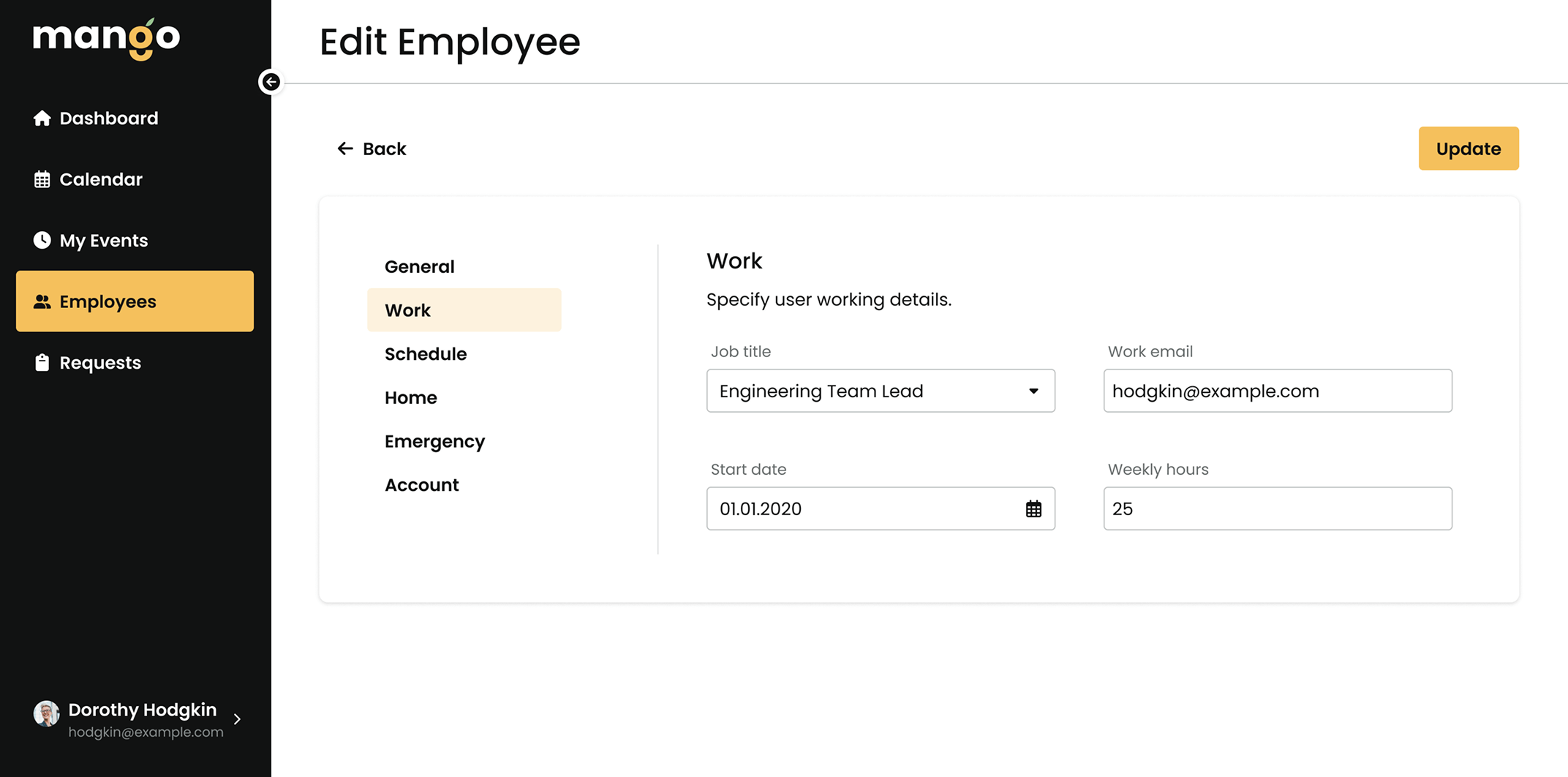
Confident Management
Personal data management is a big responsibility. Mango’s Employees section lets managers handle
work schedules, profiles, and account access securely — building a confident, organized team
environment where trust and professionalism thrive.
UI Components
Consistency creates confidence. I developed a full component library filled with ready-to-use UI
elements, making it easier for the platform to feel polished, coherent, and user-friendly at every
click. A strong backbone for a smooth experience.

Reflections & Takeaways
Taking on both UI and branding responsibilities made this project a real learning experience. While
it pushed me outside of my comfort zone, it also helped me sharpen my visual design abilities. Due
to limited team capacity, we couldn’t implement everything we envisioned, and only some parts of the
interface became available to users.