Byrd Design System
About the Project
Clean Design Library
-
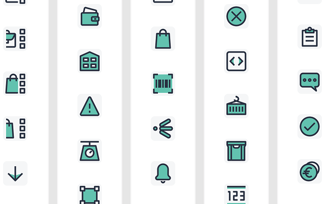 152 Hand-crafted icons
 -
 58 Components
 -
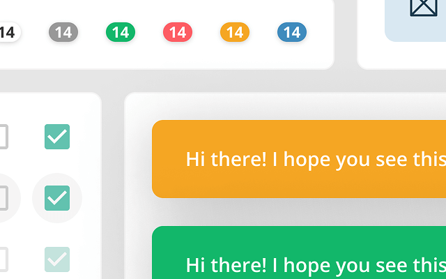 240 Variants
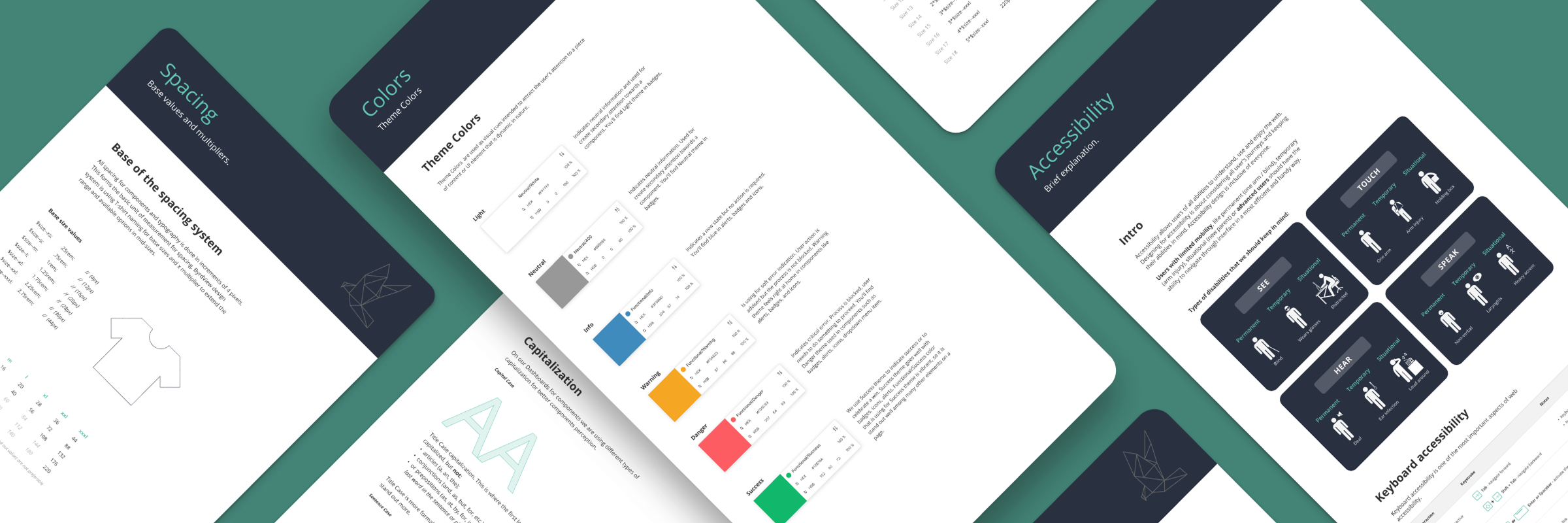
The Power of Color
-
Brand / Primary
-
Brand / Secondary
-
Brand / Tertiary
-
Brand / Primary #293141
- 800
- 600
- 400
- 100
-
Brand / Secondary #62C2AF
- 800
- 600
- 400
- 100
-
Functional / Info #3F8BBD
- 800
- 600
- 400
- 100
-
Functional / Warning #F5A623
- 800
- 600
- 400
- 100
-
Functional / Danger #FD5C63
- 800
- 600
- 400
- 100
-
Functional / Success #12B76A
- 800
- 600
- 400
- 100
-
Neutral #989898
- 900
- 800
- 700
- 600
- 500
- 400
- 300
- 200
- 100
- 50
Spacing for Precision
Crafting Icons
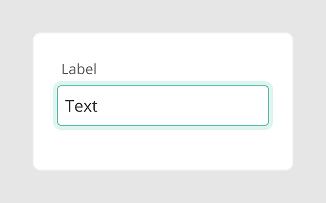
Building Blocks

Inclusive Design
-
See
-
PermanentBlind
-
TemporaryWears glasses
-
SituationalDistracted
-
-
Touch
-
PermanentOne arm
-
TemporaryArm injury
-
SituationalHolding box
-
-
Hear
-
PermanentDeaf
-
TemporaryEar infection
-
SituationalLoud around
-
-
Speak
-
PermanentNon-verbal
-
TemporaryLaryngitis
-
SituationalHeavy accent
-
-
 Primary
 -
Secondary
-
Neutral
-
White
Focus State
To make our focus state more visible and accessible, we used a combination of primary and white colors for the border. This contrast helps the focus indicator stand out clearly on both light and dark backgrounds. It improves visibility for all users, especially those using keyboard navigation.
Using both a light (white) and a dark (primary) color ensures the focus style has enough contrast, no matter the background. This technique supports better accessibility and visual clarity. It's a simple but thoughtful way to make the interface more inclusive and easier to use for everyone.

Dynamic Interaction